






























11 Simple Ideas for Your Living Room Wall Decor
The living room is the place in the home with maximum footfall and is the place to relax and entertain with family and friends.
This makes the living room, undoubtedly one of the most important spaces in your home. If you wish to inspire some creativity and create a stunning homey area, then take into consideration these living room wall décor ideas.
-
Oversized art
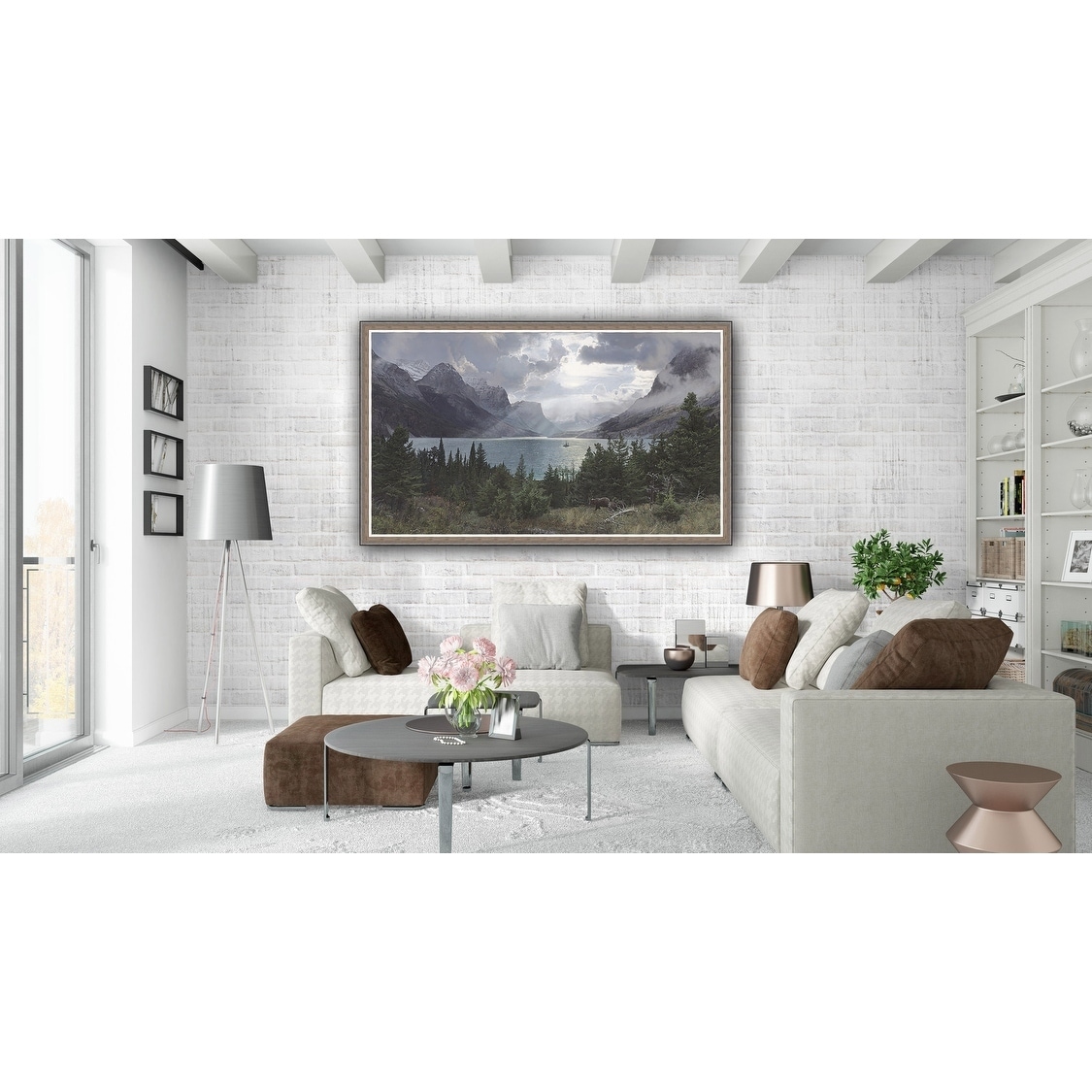
One of the most classic living room wall décor ideas is to make use of oversized art. You can place it behind the sofa-sectional or coach on the large wall that requires something big and bold to fill it. -
Gallery Wall
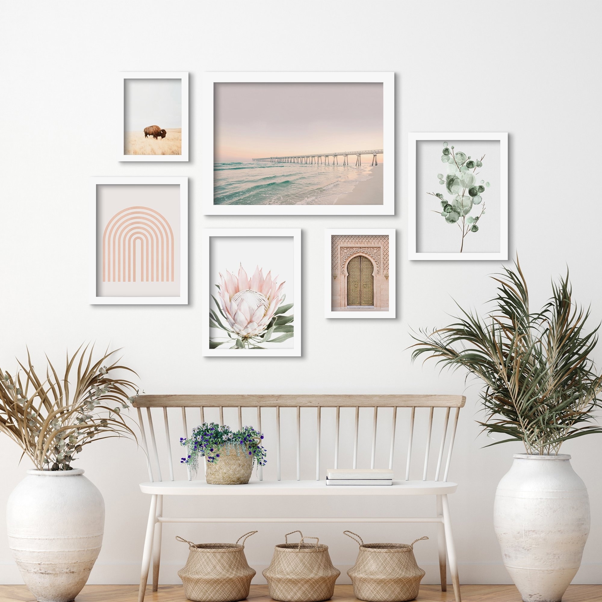
If you don’t want to settle for just one picture, try putting up a gallery wall on your big, empty wall. Gallery walls look great in the hallways or walkways and make an amazing living room décor idea. You can either incorporate and club a mix of 2-3 Wall art prints like Personalized Name Art Print, Nursery Wall Art Print, Jungle Art Print and use them together in some wall pattern. When you wish to replace them, they can also be used in different home corners, separately. -
Abstract Art Prints
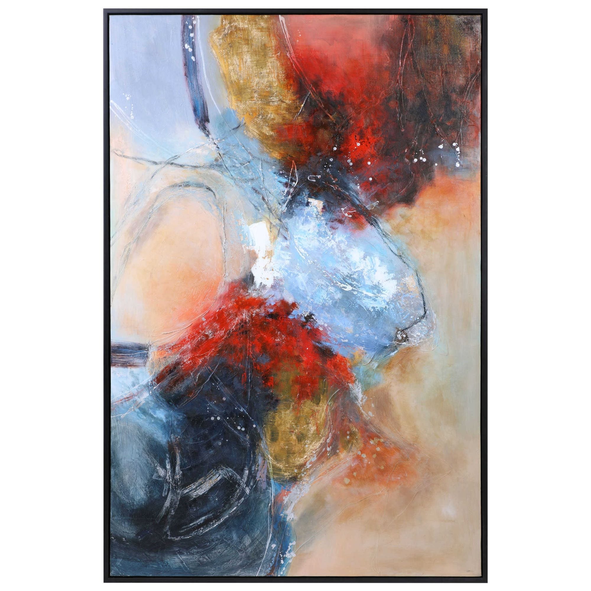
Another efficient way to tie all the colors in a room together, is by placing the two abstract art pieces hung over the sofa-sectional.This will add a pop of color to your walls while coordinating with your color scheme. -
Wall Planter
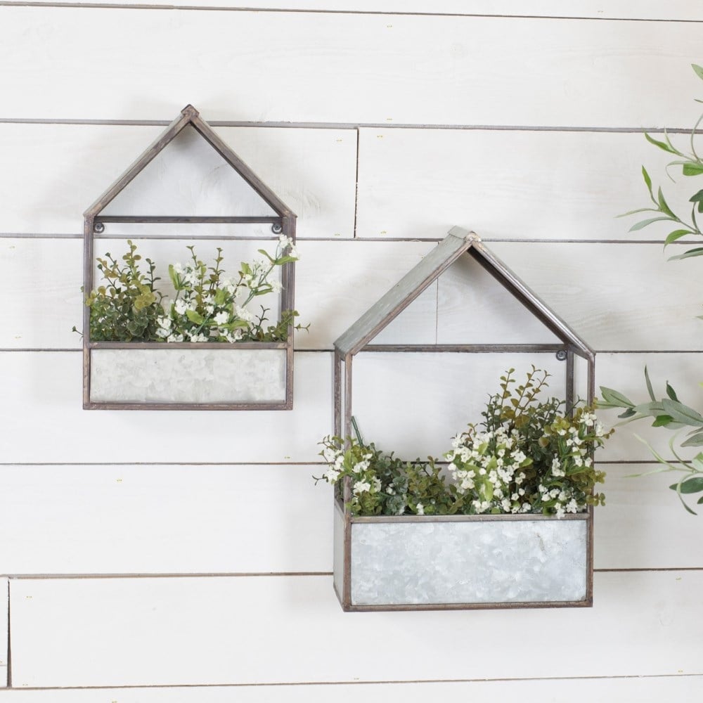
Adding some greenery inside the home can never be a bad idea. Bringing your outdoors into your indoors will brighten the living room and add some life & texture to the space likewise. Hang some wall planters where you can pt for real plants or some faux ones as per your choice and convenience. -
Install Wallpapers
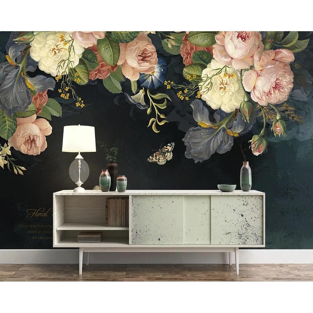
If you have enough empty space on your wall to fill, find a colorful wallpaper, which counts for an easy way to make a feature wall and add a wow factor.
-
Get an Interesting Mirror
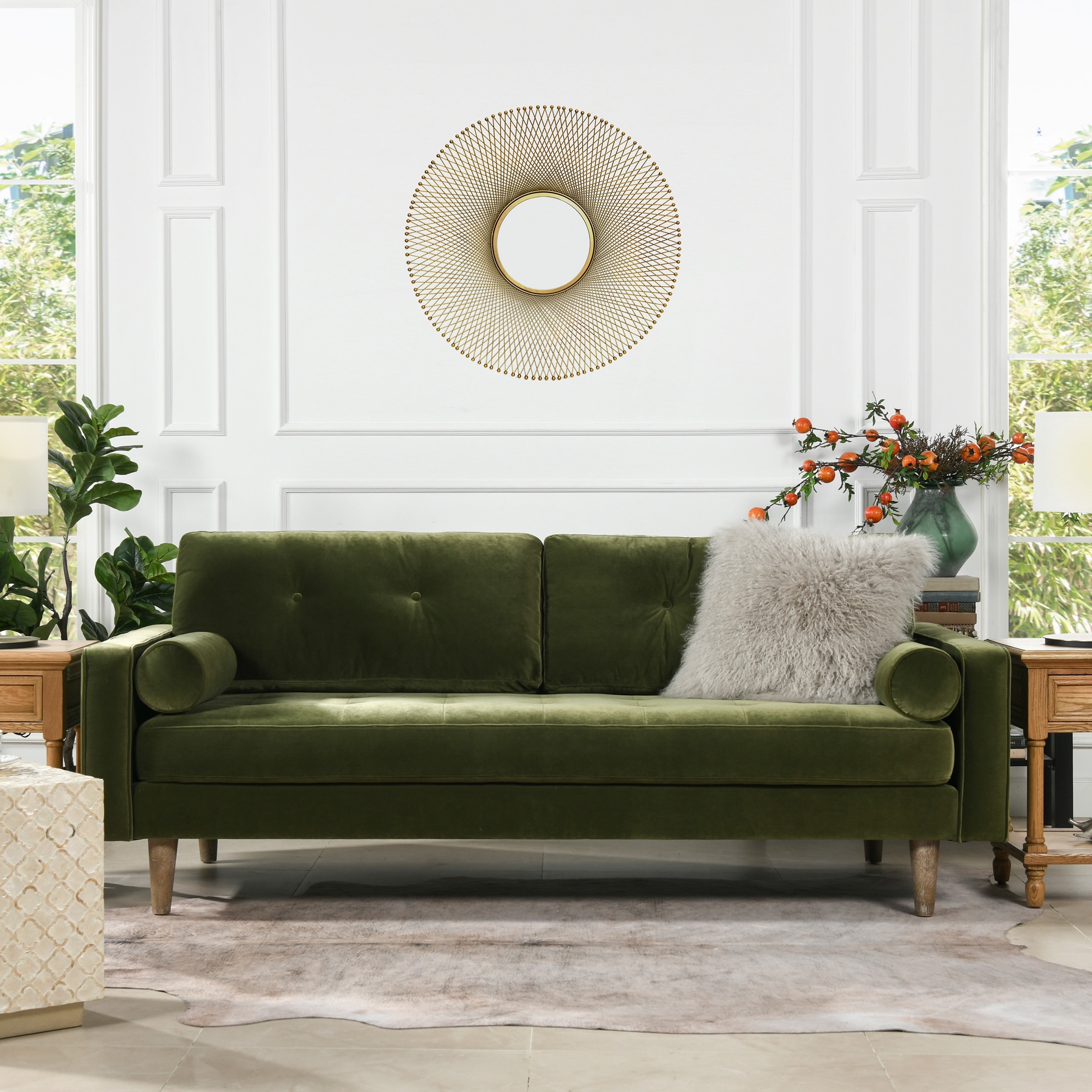
When talking about wall décor and the mirrors, then you must think beyond squares and rectangles. Today, you can find them both online and offline in all sorts of shapes and sizes for every style.The color and finish option too is endless to suit your type of interior. Mirrors are a very useful design trick as they always make a small space help appear visually bigger and brighter.
-
Install Floating Shelves
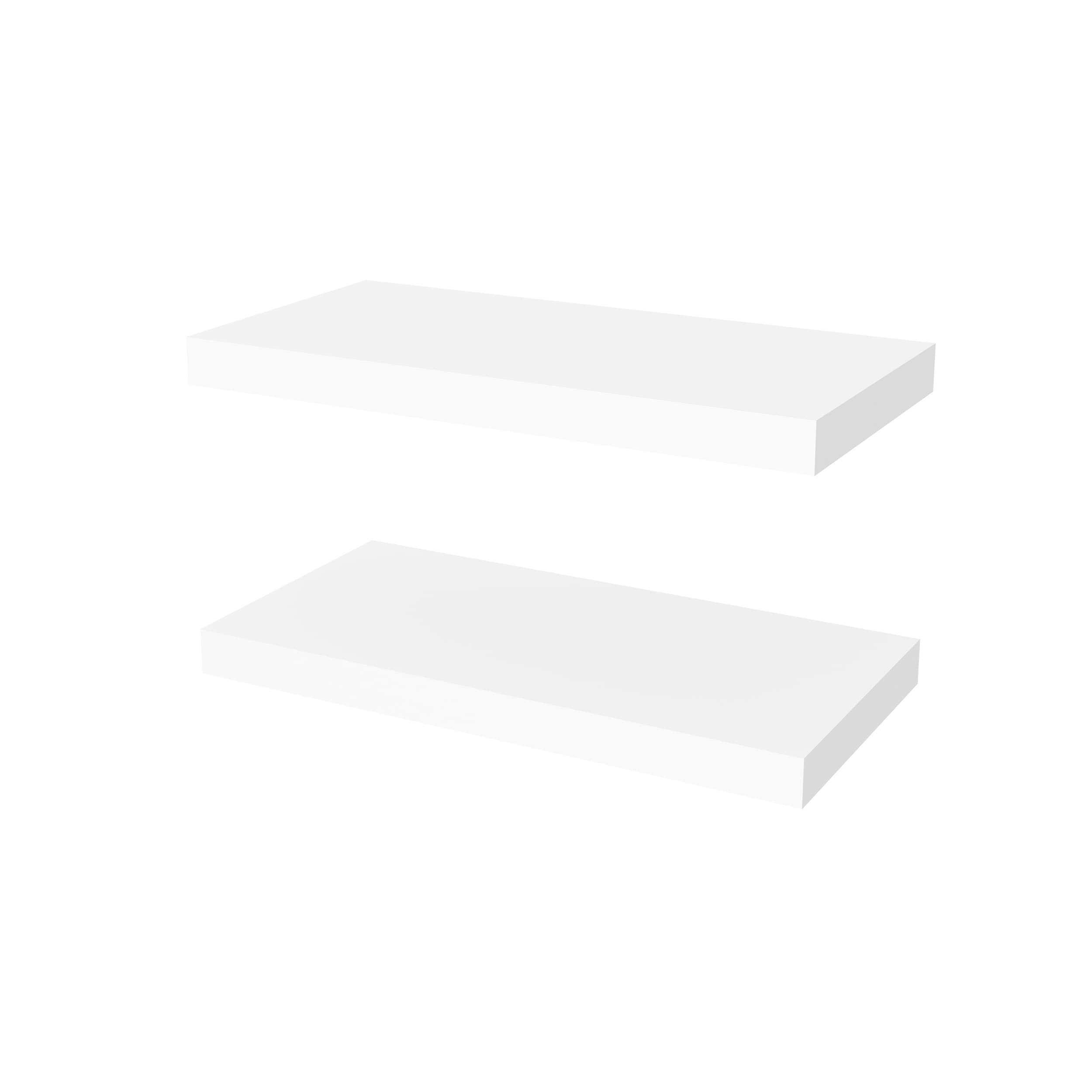
Never underestimate the power of shelving, especially floating shelves. You can install them anywhere in the living room and it can be versatile in terms of size and numbers, depending upon the space availability.To decorate these floating shelves, make use of curios, figurines, artifacts, etc. of differing heights, colors, and shapes. Break the rules by adding some vines, brass candlesticks, books, and prints on the open-shelving.
-
Faux Animal Heads
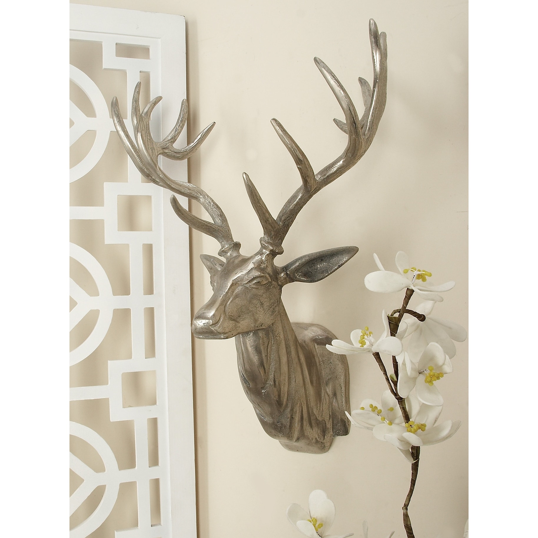
Infuse some rustic feels into your space with faux animal heads on the wall. These faux heads can be made of all kinds of different materials, from paper Mache to ceramics featuring glitter.It’s a style and a contemporary way of decorating the living room walls that works in even the most feminine of spaces. These are sure to create a dynamic and eye-catching wall feature.
-
Showcase Your Basket Collection
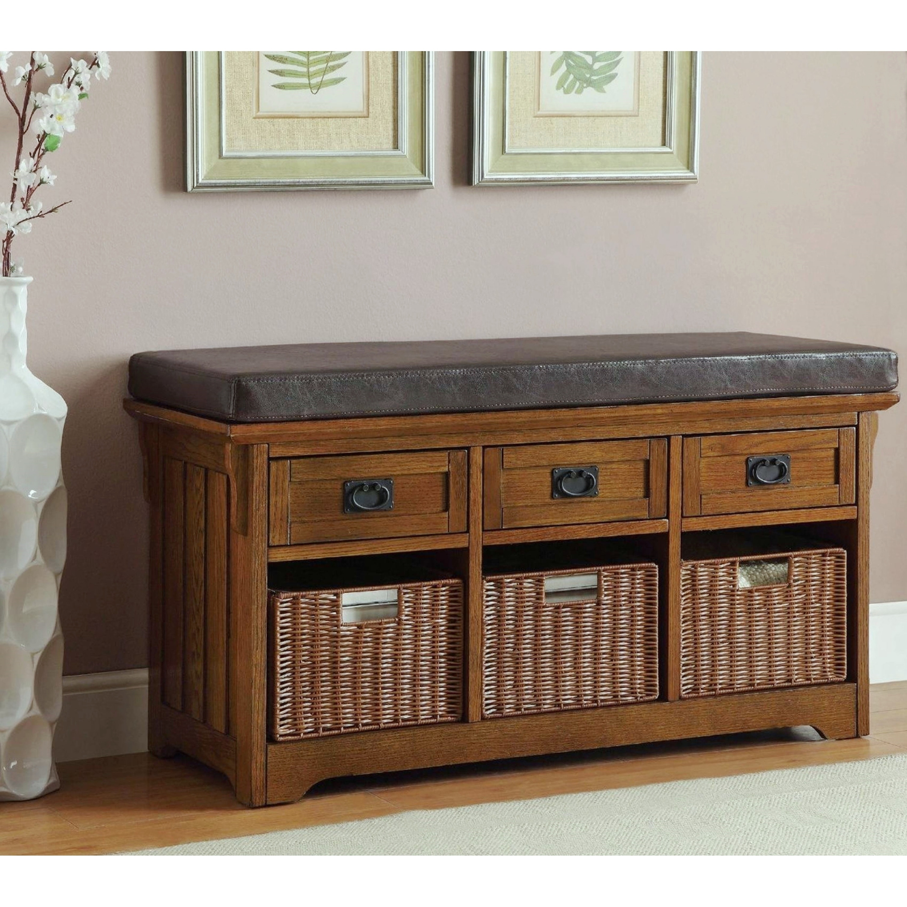
Yet another interesting way to warm-up your living room's white walls is with a collection of woven baskets. The natural material will bring a cozy vibe to your space, while the woven element adds texture and dimension to the walls. -
Use Woven Wall Hanging
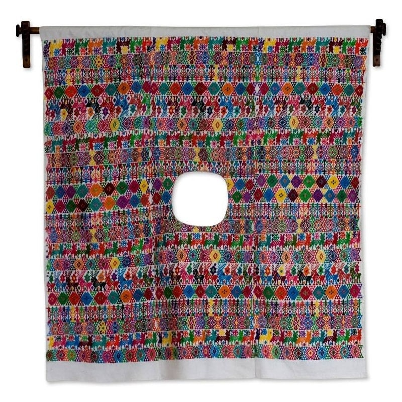
If you’re a fan of bohemian style, then macrame wall hanging is just for you. The flat-weave textiles on walls are back in trend. These add pattern and texture to your space while adding some vintage-inspired element into your space. -
Patterned Tapestry
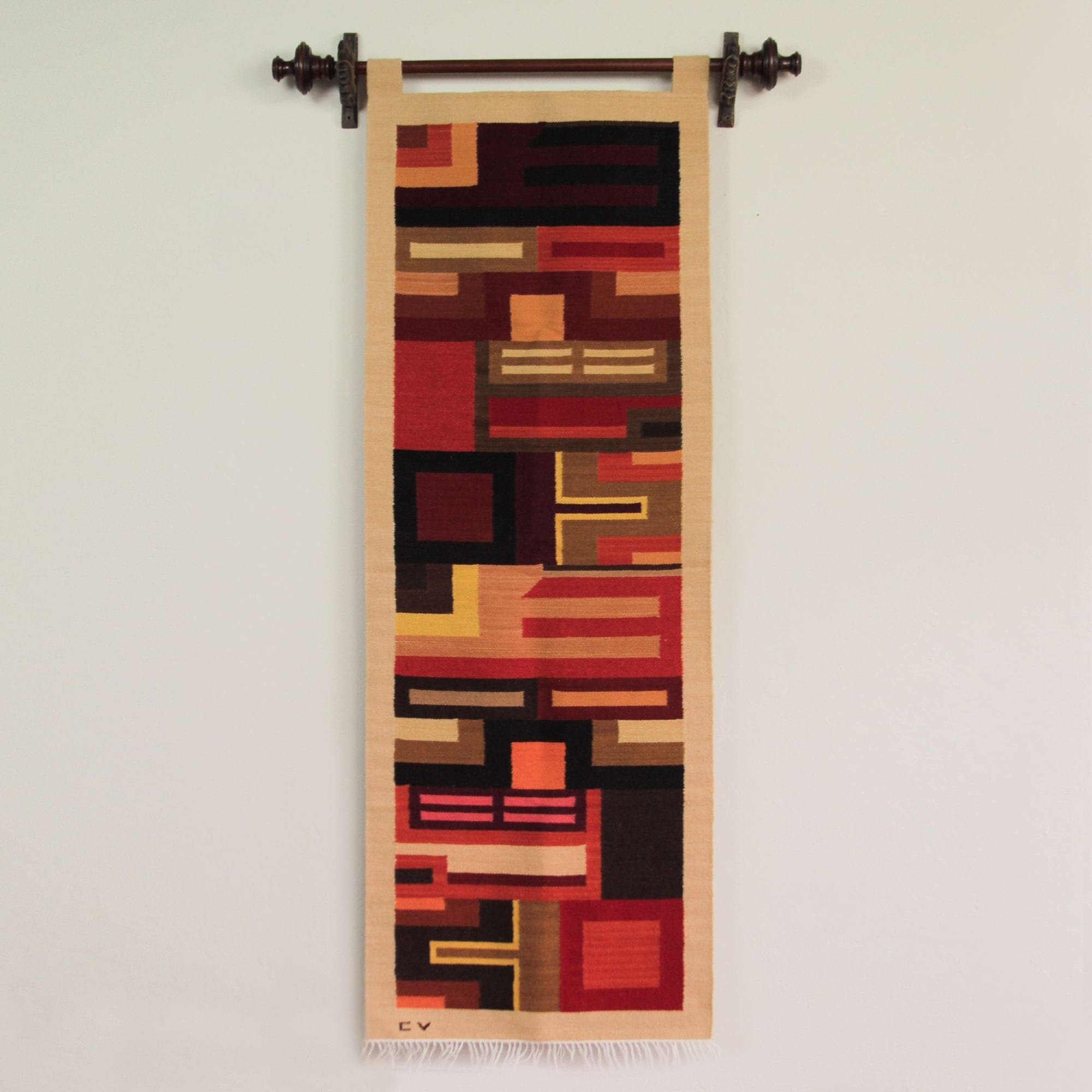
Pack a powerful punch on your living room wall by hanging a colorful tapestry. Choose a pattern, design, theme, and color that complements your room’s design.
Final Takeaway
Blank living room walls can be a total headache when you don’t have time, funds or ideas. But now after scrolling through the above discussed wall decor ideas for every type of person: the wall art prints, wall planters, floating shelves, and more you can now be a focused, functionalist, and salvaging soul.
About DiviArts Studio
We at DiviArts Studio have a wide assortment of watercolour wall art prints, digital printable art, customized pet portraits, posters, greeting cards, coffee mugs, gifts, and art products all in different themes, and we’ll help you find the perfect one that you need. Liven up your home with our art pieces that are totally affordable and will undeniably tie your entire space together. Explore the exclusive range now and instantly elevate your interior décor, or simply gift it to your near and dear ones as a token of love and care. We offer hassle-free worldwide shipping.
About Divisha Mehta


